Enterprise UX
from start to finish.
At a major Belgian player in the meat industry (name under NDA), I led a full end-to-end UX design track as UX Designer: from shop-floor observation and user stories to a scalable design system, in close collaboration with a Scrum Master, developers, a Product Owner and stakeholders at the client.
- SECTOR
- Food production · Belgium
- MY ROLE
- UX Designer @ Octoo
- TYPE
- Consultancy
- APPROACH
- Agile / Scrum
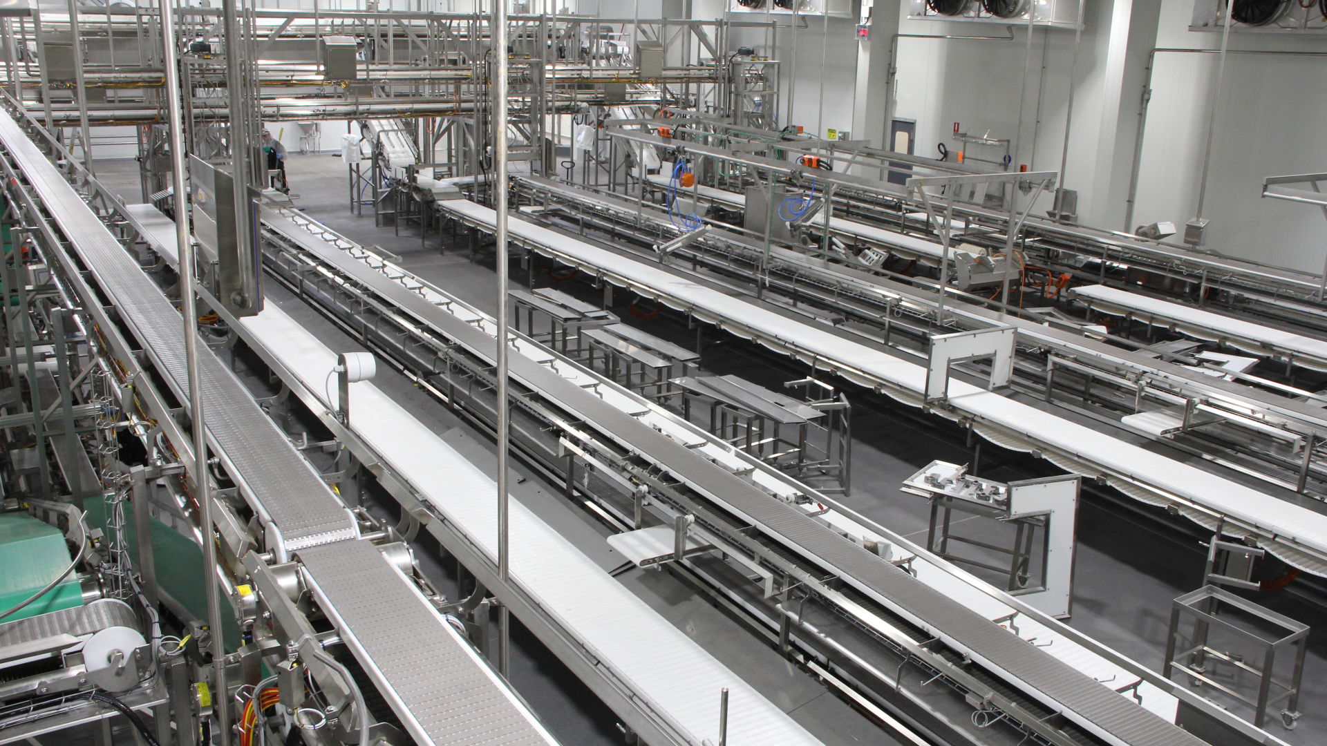
The situation: digital chaos in a complex organisation
A Belgian production company with multiple sites, thousands of employees and annual production in the hundreds of thousands of tons. Digitalisation was a core pillar, but the execution was fragmented: every department worked with a separate software tool, each with its own logic, style and usability. The result? Users (operators, planners, supervisors) got frustrated. Efficiency suffered. And there was no shared foundation to build on.
Collaborating in a cross-functional Scrum team
We ran this project entirely in Agile/Scrum. My role as UX Designer was not limited to making wireframes. I facilitated, translated and connected. That required close collaboration with everyone on the team, and with the people on the shop floor.
“I actively took part in sprint ceremonies. Together with the Scrum Master, I made sure UX insights didn’t pop up at the end of a sprint, but were the starting point of every new one.”
Discovery as the spine of the project
Not as a one-off step, but as an ongoing reference point. I combined multiple research methods to get a full picture of the context, the users and the friction.
On-site visit & contextual inquiry
I visited the production floor to observe how operators actually work, not how they say they work. Specific focus on one of the more complex workstations. This produced insights you’d never get from interviews alone: the paper logbook next to the computer, the bright helmet making the screen hard to read in certain light, the time pressure during product changeovers.
User stories & How Might We
Every usability problem I rewrote as an open HMW question, after which we used Crazy 8's and a 10-minute design challenge to look for solutions. I did this exercise with the whole team, not just as the UX designer. That way everyone had the real problem in mind before a single wireframe hit the table.
Enterprise users expect training, even when the screen is user-friendly. That expectation had to shape the tone of our design approach: not remove it, but guide it smartly.
From paper sketches to tested low-fi prototypes
I almost always start on paper. Not because it’s required, but because it slows down thinking in the right way: you draw solutions, not visuals. Then I move to Miro for low-fidelity wireframes, mapped to the stories from discovery. The focus of the wireframes was on efficiency and process logic, not aesthetics.
Low-fidelity first
Test fast and gather feedback before investing in details. Involve key users as soon as there’s anything to show, even if it’s still rough.
Dev alignment per sprint
Every iteration discussed with front-end developers. Technical constraints became design constraints: not blockers, but frames to work within smartly.
Documentation for traceability
Changes documented with reasoning. In an enterprise context, decisions need to be traceable, also for stakeholders who weren’t in every session.
Systemic thinking
One screen impacts dozens of others. Every choice was checked against the whole, not just the one flow we built that sprint.
Testing on the shop floor, not in a meeting room
We tested in two rounds: first low-fidelity prototypes, then high-fidelity screens. Always with real users, always in context. A usability test in a lab is one thing. Observing someone trying to complete the flow while a batch is waiting is another.
Efficiency
Can users do their tasks faster than with the old tools? Where do they lose time?
Clarity
Do they understand what to do without explanation? Where do they hesitate or ask for confirmation?
Process logic
Does the digital flow match their mental model? That can only be validated on site.
I let users carry out tasks that simulated their real work. No briefing in advance, no steering during. I observed where they got stuck, hesitated or made mistakes and noted it as factually as possible. A short debrief afterwards uncovered the reason behind the behaviour.
“Thanks to the new screens I’ll be able to work so much better. I can’t wait for them to be developed.”
Building a foundation, not solving screen by screen
The real challenge wasn’t improving one module, but laying a foundation on which all current and future applications could rest. That asked for a design system that was usable for both designers and developers.
Component kit with 30+ UI components
Built on an existing component kit as a foundation. Components ready to use, consistent and scalable.
Component playground for developers
A central place where all UI components were stored, documented and tested. No translation loss.
Visual tokens
Colour, typography, grid and spacing as a shared language. Colour as a carrier of meaning, not decoration.
UX patterns
For navigation, forms and feedback, reusable across all applications.
The design system was not the end product. It was the infrastructure that let everyone work faster and better.
What this project taught me
- 01
Respect for complexity
Don’t over-simplify. Complex business processes are complex for a reason. My job wasn’t to remove that, but to make it understandable.
- 02
Research and design overlap
Every test session brought new questions. Discovery didn’t end after the first sprint, it stayed a living reference.
- 03
Make insights visible
Communicating with developers, POs and managers in a way that convinces without patronising.
- 04
Pick your battles
Learning when to hold firm and when to adapt. Not every discussion is a matter of principle.
- 05
AI as a co-pilot
For clustering data, summarising findings, documentation. The design decisions stayed human work.
